Write A Review (WAR)
how I tackled this Challenge
Brief
Angie’s List’s “Write a Review” funnel is more than a feedback form; it’s the pulse of their business model. When it needed a fresh visual direction, I leaned into a full-spectrum UX effort to reimagine its structure and clarity.
I partnered with a seasoned researcher who ran interviews and synthesized user insights. Meanwhile, I executed heuristic evaluations of the current experience and competitor benchmarks. From there, I moved into interaction and visual design, shaping prototypes and validating the results with client and user feedback.
Deliverables
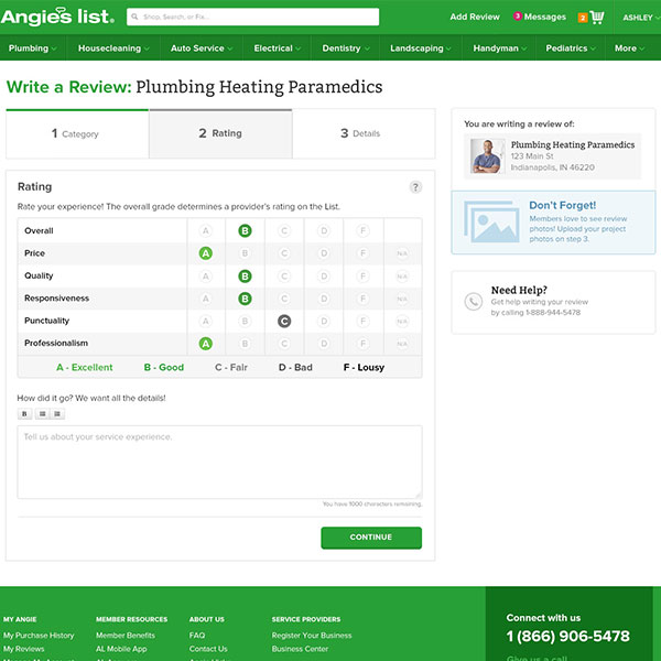
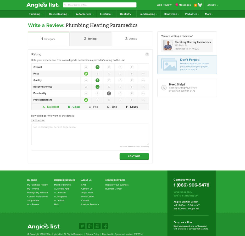
Rapidly translated research and design exploration into a 15-screen 48 variable design clickable prototype, enabling early usability testing and accelerating stakeholder feedback.


Results
Heuristics / Interaction Design
Identified key pain points in the user journey, such as unclear navigation, redundant steps, and proposed actionable solutions to address them.
Viz Design
Reinvented the visual hierarchy of Angie’s List’s “Write a Review” journey, creating clarity and engagement in a space central to lead generation and service validation.
Heuristics / Interaction Design
Introduced interaction patterns and visual cues that guided users more intuitively through the funnel, reducing friction and increasing successful submissions.